
Custom Color Options for Commercial Planters
Colors for commercial planters aren’t limited to black, gray, or other neutral finishes. You have options.
For architects, landscape architects, interior designers, developers, and contractors, color selection is more than a decorative decision. The color and finish of a commercial planter can affect:
How a space feels
How people move through the space
How the planter performs over time
How closely the finished project aligns with the original design intent
In this article, we’ll cover:
Why color matters in commercial planter design
How architects and designers select planter colors
The benefits of powder-coated aluminum for custom colors
How color and finishes compare
Popular color approaches for schools, hospitality spaces, campuses, multifamily developments, rooftops, and public spaces
Key finish considerations, including gloss level, sun exposure, maintenance, and color consistency
Real-world examples of custom-colored commercial planter projects
Can Commercial Planters Be Custom Colored?
Yes. Commercial planters are available in a wide range of custom colors and finishes to align with project branding, architectural materials, campus identity, wayfinding goals, or the desired atmosphere of the space.
The best option depends on the project environment, material requirements, maintenance expectations, and overall design vision.
Explore Custom Commercial Planter Finishes
See how architects and designers are using custom-colored planter systems in schools, hospitality spaces, campuses, and mixed-use developments.
Why Colors Matter in Commercial Planter Design
Color influences how a commercial environment feels and functions.
Custom planter colors can help project teams:
Create memorable public spaces
Reinforce brand colors or campus palettes
Guide movement through large spaces
Define entrances, gathering areas, or activity zones
Add energy, warmth, calmness, or contrast
Support placemaking in public environments
Create visual cohesion with surrounding architecture
Make outdoor and interior spaces feel more intentional
In commercial environments, planters are often an intentional part of the design, helping connect architecture, landscape, and the way people experience the space.
The right color and finish help a planter support the broader experience of the space:
Adding a bold color can make a school terrace feel more energetic and welcoming.
A neutral matte finish can help a planter blend into a luxury hospitality environment.
A weathered finish can connect a mixed-use development to its industrial surroundings.
Whether the project is a school courtyard, hospitality terrace, corporate campus, multifamily amenity space, rooftop environment, streetscape, or public plaza, custom planter colors can transform a functional landscape element into a very intentional part of the built environment.
See This Concept in Practice: Colgate Elementary School
Colgate Elementary School — Dundalk, Maryland
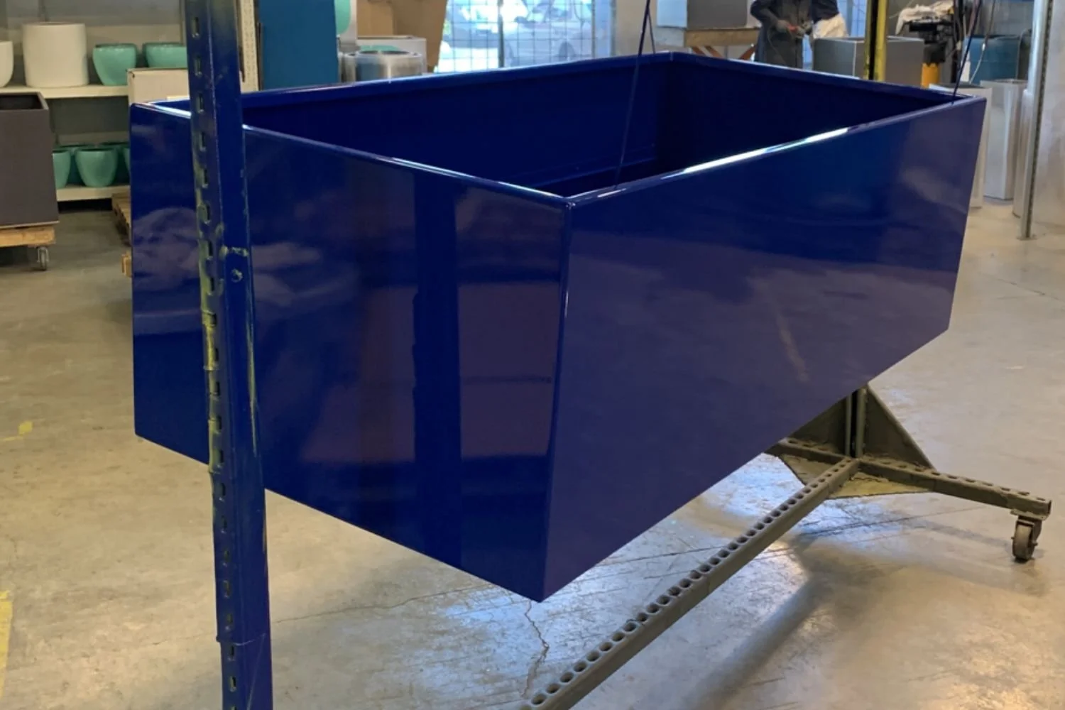
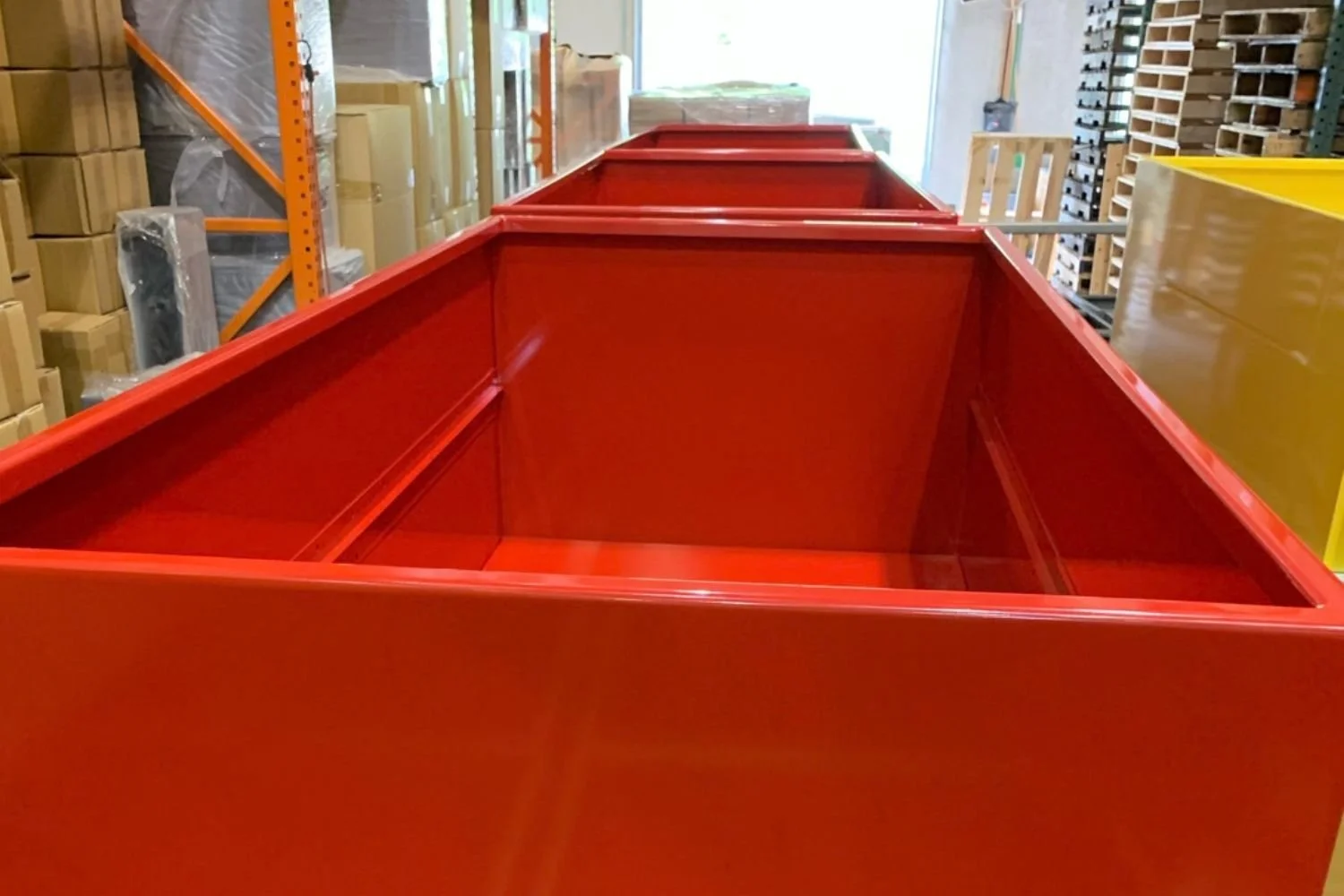
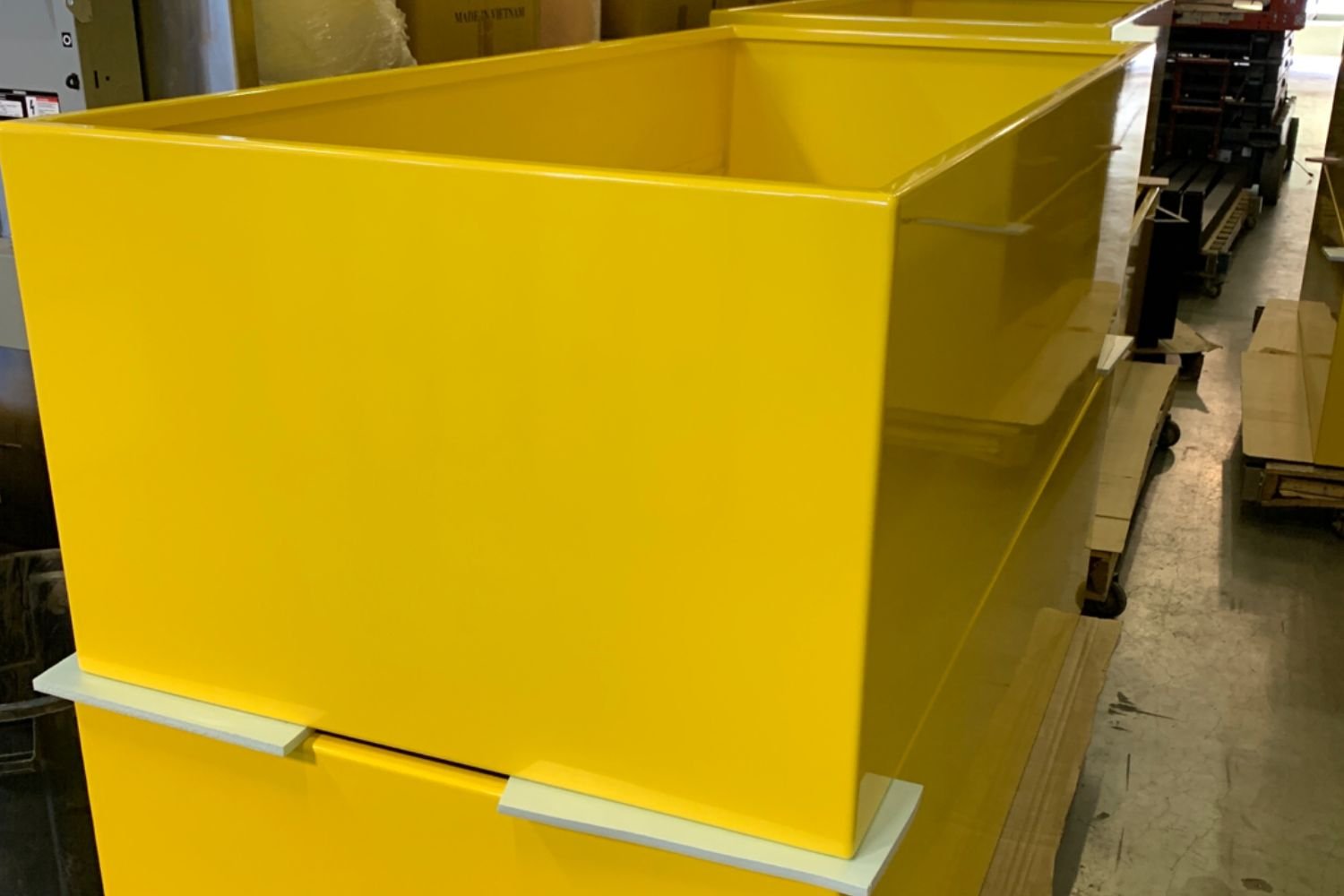
For an outdoor garden space on the school terrace, PureModern fabricated custom commercial planters in bright blue, red, and yellow powder-coated finishes. The colorful planter systems helped create a more playful, welcoming environment for students and visitors while adding visual interest to the terrace landscape. This approach can be especially effective in schools, youth spaces, creative campuses, and public gathering environments where the landscape is meant to feel engaging, memorable, and accessible.
How Architects & Designers Select Commercial Planter Colors
Architects and designers typically choose commercial planter colors by considering how the planter system will support the larger project vision. While every project is different, color decisions often come down to a few key considerations:
1. Matching Brand Identity
Custom-colored commercial planters can reinforce brand recognition for a company, school, university, etc.
2. Complementing the Architecture
Planter colors can either blend into the architecture or create intentional contrast.
Dark powder-coated aluminum planters complement glass, concrete, or modern metal facades.
Warm earth tones work well alongside stone, wood, or weathering steel.
Bright colors create focal points within minimalist architecture or otherwise neutral public spaces.
In many commercial projects, the best finish is one that supports the overall material palette without competing with the architecture.
3. Supporting Wayfinding and Experience
Color can help people more easily understand how to move through a space.
In large campuses, healthcare environments, mixed-use developments, and public plazas, colored planter systems can help:
Identify entrances
Differentiate gathering areas
Create visual landmarks
Guide circulation
Separate activity zones
Make outdoor spaces easier to navigate
4. Responding to the Surroundings
It’s important to consider the surrounding environment when selecting color. For example, the building, hardscape, plant material, lighting, signage, and surrounding neighborhood.
The Most Versatile Option: Commercial Powder-Coated Marine-Grade Aluminum Planters
Powder-coated aluminum is one of the most versatile options for commercial planter projects because it offers both color flexibility and long-term durability.
For architects and designers, powder coating makes it possible to move beyond standard finishes and specify planter systems that align with branding, architecture, or placemaking goals.
Powder-coated commercial planters are commonly used in:
Schools and campuses
Hospitality spaces
Corporate headquarters
Multifamily amenity areas
Rooftop environments
Streetscapes
Public plazas
Retail and mixed-use developments
Commercial - Grade Powder Coat: Tiger Drylac
PureModern uses Tiger Drylac for many commercial planter applications.
Powder coating can help provide:
Broad color flexibility
Consistent finish coverage
UV resistance
Weather resistance
Long-term durability
A lower-maintenance finish for demanding commercial environments
As with any finish, the best powder coat selection depends on the project location, exposure conditions, color choice, gloss level, maintenance plan, and performance requirements.
Comparing Color & Finish Options for Commercial Planters
-
Best for:
Custom colors and branding
Schools and campuses
Hospitality environments
Rooftop applications
Lightweight durability
Streetscapes and public spaces
Projects requiring broad finish flexibility
Powder-coated aluminum is often the strongest choice when a project requires a specific color, a lightweight commercial-grade material, or a finish that complements a larger architectural palette.
Because aluminum is lighter than steel, it often makes sense for rooftop amenity design and projects where structural load is an important consideration.
Project Example: Colgate Elementary School
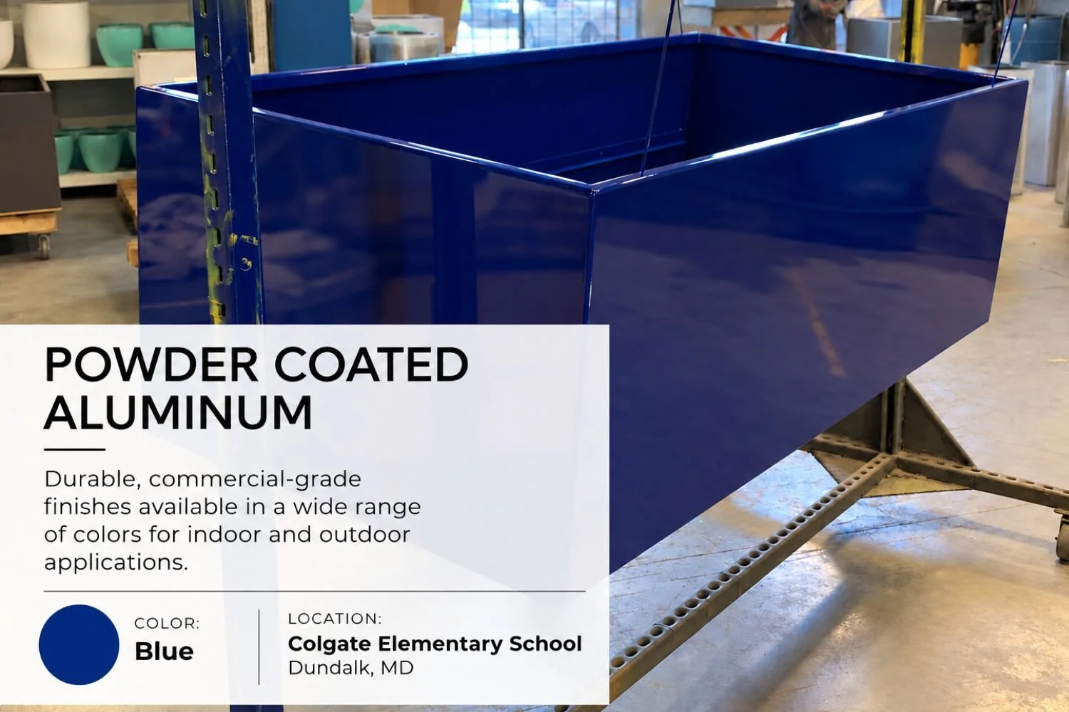
At Colgate Elementary School, blue, red, and yellow powder-coated aluminum planters helped create a bright, engaging terrace garden environment designed for students and visitors.
-
Best for:
Lightweight planter systems
Irregular shaped planters
Interior commercial environments
Hospitality and retail projects
For projects that require a clean, contemporary look, custom-colored fiberglass can be an effective option.
Project Example: Scan Design — Altamonte Springs, Florida
At Scan Design, white planter systems helped support a clean, modern retail environment. The project demonstrates how a custom finish does not need to be bold to be intentional.
In many commercial settings, a crisp neutral color can reinforce the architecture while allowing plant material and surrounding design elements to remain the focus.
-
Best for:
Achieving a weathered steel appearance with reduced weight
Rooftop applications
Projects where staining from natural oxidation may be a concern
Environments requiring easier mobility
Projects with structural load considerations
Commercial environments where a rust-like aesthetic is desired without using weathering steel
Faux rust aluminum can provide the visual warmth of weathering steel while retaining the lightweight and corrosion-resistant advantages of aluminum.
This can be especially useful for rooftop amenities, hospitality terraces, and commercial projects where a weathered appearance is desired but natural oxidation or material weight may complicate design considerations.
Project Example: Westfield Valencia Town Center — Valencia, California
At Westfield Valencia Town Center, faux rust aluminum planter systems helped create a warm, architectural look while supporting the practical needs of a commercial retail environment.
-
Best for:
Custom branding
Bold architectural statements
Schools and campuses
Hospitality environments
Corporate spaces
Vibrant public environments
Projects that require a distinctive material appearance
Specialty finishes like metallic silver allow designers to move beyond standard powder coat colors and create more customized options.
For example, metallic silver aluminum can mimic the appearance of stainless steel while providing the fabrication flexibility and performance advantages of aluminum.
Project Example: National Cancer Institute — Rockville, Maryland
At the National Cancer Institute, a metallic silver finish helped create a refined, contemporary appearance.
Popular Custom Colors for Commercial Planters
Bold and Vibrant Colors
Bold custom planter colors are often used in:
Schools
Creative campuses
Youth spaces
Public gathering areas
Retail environments
Community-focused developments
Bright colors can add energy, create visual landmarks, and help make public spaces feel more welcoming and memorable.
Neutral Architectural Finishes
Neutral planter finishes are commonly used in:
Hospitality projects
Multifamily developments
Urban mixed-use environments
Corporate campuses
Office entrances
Luxury retail settings
Black, white, gray, bronze, and muted earth tones can help planter systems feel integrated with architecture and hardscape materials.
Natural and Earth-Tone Finishes
Natural finishes are often selected for:
Landscape-focused environments
Parks
Wellness spaces
Biophilic design projects
Campus landscapes
Historic or industrial redevelopment projects
Weathering steel, faux rust aluminum, warm browns, deep greens, and muted natural tones can help create a stronger connection between the built environment and the surrounding landscape.


What Should Project Teams Consider When Selecting Custom Planter Colors?
Choosing a custom color involves more than selecting a shade from a chart. Project teams should consider:
Gloss, Matte, or Textured Finish:
Gloss levels can significantly change how a planter looks in the finished environment. A high-gloss finish may create a bold, polished statement, while matte or textured finishes may feel more architectural and help reduce the visibility of surface wear.
Sun Exposure and UV Performance:
Bright colors and dark finishes can appear differently in direct sunlight than they do in shade. Long-term UV exposure should be considered when selecting colors for outdoor commercial environments.
Surrounding Materials:
Whenever possible, we recommend comparing physical finish samples in the project’s actual lighting and building facades, paving, furniture, railings, signage, lighting, and plant material. Reviewing physical samples can help project teams make more confident finish decisions.
Maintenance Expectations:
The project’s maintenance plan should influence finish selection. High-touch, high-traffic, or public-facing environments may benefit from finishes that are selected with visible wear, cleaning needs, and long-term appearance in mind.
Color Consistency Across Large Projects:
For large commercial projects, consistency matters. Project teams should consider how colors will appear across multiple planter sizes, fabrication batches, and installation phases.
Indoor or Outdoor Application:
Interior commercial planters may have different finish requirements than exterior planter systems. Outdoor planters must account for weather exposure, UV conditions, drainage, and environmental wear.
Common Mistakes We See With Commercial Planter Colors
Overusing Bright Colors:
Bright colors can create energy and visual interest, but using too many competing colors can overwhelm the space. The strongest designs typically use color with intention—highlighting key zones, reinforcing identity, or creating visual rhythm.
Ignoring Lighting Conditions:
Colors look different in full sun, shade, interior lighting, and nighttime environments. A finish that looks ideal in a sample may appear very different once installed. Reviewing colors in context can help avoid surprises.
Forgetting Long-Term Maintenance:
Commercial planter finishes should be selected with long-term performance in mind. Exposure conditions, cleaning practices, public use, and potential wear should all be considered before finalizing a custom color.
PureModern’s Approach to Custom Color Selection for Commercial Planters
At PureModern, custom planter color selection is treated as part of the larger commercial project strategy—not as an afterthought.
The team works with architects, landscape architects, designers, developers, and contractors to help align:
Planter finish
Material selection
Durability requirements
Project branding
Architectural context
Structural considerations
Drainage requirements
Fabrication capabilities
Installation conditions
PureModern’s custom fabrication and powder coating capabilities allow project teams to move beyond standard finishes and create commercial planter systems that support both design intent and long-term performance.
For complex commercial projects, selecting the right planter manufacturer involves more than comparing product dimensions. The right partner should understand how finish, material, fabrication, logistics, and installation considerations work together to influence project outcomes.
Looking for Custom-Colored Commercial Planters?
PureModern can help project teams explore:
Custom powder coating
Branded commercial planter systems
Architectural color and finish options
Commercial-grade materials
Lightweight rooftop planter solutions
Large-scale custom fabrication
Project-specific specification support
Frequently Asked Questions About Custom Commercial Planter Colors
What is the most durable finish for commercial planters?
Powder-coated finishes are among the most durable options for commercial planters because they can provide strong resistance to weather, fading, and wear. The best finish depends on the material, project environment, sun exposure, maintenance plan, and performance requirements.
How do architects choose planter colors?
Architects and designers often select planter colors based on branding, surrounding materials, campus identity, wayfinding goals, project atmosphere, maintenance expectations, and the broader architectural palette.
Can commercial planters match brand colors?
Yes. Many commercial planter systems can be custom colored to coordinate with school colors, corporate branding, hospitality palettes, architectural finishes, or public-space identity systems.
Are bright-colored commercial planters appropriate for outdoor spaces?
Yes, when the finish is selected for the project environment and long-term exposure conditions. Bright colors are commonly used in schools, campuses, public gathering areas, and creative commercial environments.
Can commercial planters be custom colored for rooftop amenities?
Yes. Powder-coated aluminum or fiberglass planters are often a strong option for rooftop amenity design because it can provide custom color flexibility while helping reduce planter weight compared with heavier material options.
